Saturday, 28 March 2015

Feedback


Feedback from the opening sequence 

After putting our opening sequence on youtube we had positive feedback from friends giving us their views of our opening sequence.  They said how they thought that the shot from behind the victim was effective and how the camcorder special effect made it feel like they were the watcher, I took from this information that the special effects we incorporated made a difference to our piece and that the shots from the actors made the audience feel like they were there in the scene. The positive response helped us to understand an audiences point of view of our opening sequence and how to improve it to a better standard.


Friday, 20 March 2015

The opening Sequence

The opening sequence 

The opening sequence had a positive feetdback from friends and family, it allowed us to focus on parts which weren't as good as others and improve them to be a high standard. Certain shots like the ones of the knifes, it wasn't as clear so when we next film we focused on the parts we need to improve. We thought that the music was good but from the feedback we got back we saw that at some points the music was too repetitive, also our teacher helped us to spot shots which could be better for example when the victim is leaving their house and it is like the audience is watching them but trying to stay hidden, that shot could have been improved if the camera zooms in more to the victim to make the audience focus on him more. 
I think that we were able to build up tension well throughout the opening sequence. we use Mise en scene to make sure it was clear that it was the thriller genre.

Thursday, 5 March 2015

Preliminary Task


Preliminary Task

This was our first attempt of using a camera and we were able to have some experience with it and have a better understanding of the different features the camera has. We were able to incorporate some media techniques like match on action and see the effects with and without them, we explored the effects of the"over the shoulder" shot which would make the audience feel like they are in the scene and allow them to develop the emotions which the characters could have. The Preliminary task helped my group to develop some ideas of shots we would like in our opening sequence and if it would suit our genre and theme. This preliminary task showed us what we need to work on like making sure our hand is steady and using the tripod as much as possible. Also we used shot reverse shot when the questioning was happening because we thought that could build up tension for one of the characters to explode into anger, so I think that the shot reverse shot helped to build up to the climax.


Wednesday, 4 March 2015

Video Feedback


Video Feedback 

I acted my friend to watch my opening sequence and then if she will be able to give me feedback on video about it, she told me what the main parts she thought were good about my opening sequence, also I thought she would be brilliant to film as she was an example of my target audience so her view on the opening scene was important to our group. She spoke about the effect that the flashback had to her as an audience member and how it linked to the storyline. She spoke about how she thought she was in the scene when watching it as we filmed from the characters point of view.


Tuesday, 24 February 2015

Our Production logo


Production logo

When developing ideas about our production logo we had to create a name and an image which will be different and bring attention to our target audience, as we are doing a thriller opening sequence I thought our production logo should be based on the thriller genre, then we came up with the name Eye Spy because it may be related to the children genre but I thought with our image it could have a different effect.
Our opening sequence is based on someone watching a person and being paranoid throughout so our production logo and name should be similar to our opening sequence. The image of the eye is to indicate to the audience that our production company is based around the thriller genre and red is  usually linked with fear and the thriller genre. Eye Spy links with the image we have created and even though it may be related to kids, we thought it could represent the thriller genre so like a stalker so it has that elemnt of fear for the audience.

I think our production logo is simple but affective and it brings the type of atmosphere we wanted, production logos are very important as it allows the audience to recognise which production company created this film. We chose to use "Eye" instead of "I" as we thought it would be affective towards the audience and make it seem as someone is watching you. 


Video Diary


Video Diary 


The video Diary we did allowed us to explain our thoughts behind the opening sequence and the certain shots we thought were good in our piece as well as what we could improve on and change next time.

We had to evaluate the shots which we have done already and state what we liked about our piece and what can be improved to make our piece better, the video dairy helped us to understand our strengths in this piece  and our weaknesses. We spoke about the match on action we did and the effects it created and how it helped our opening sequence, and spoke about certain shots which had top be re-filmed so it was clearer for the audience to see.

I understood the real value of doing a video diary and how it helps us and the audience understand the effects of our shots and what our intention was for the different shots.


Tuesday, 17 February 2015

Test font choices


  Test font choices 

There are many different types of fonts available but certain fonts take someones work to another level, The choice of font and where it would be placed was difficult for me to decide.

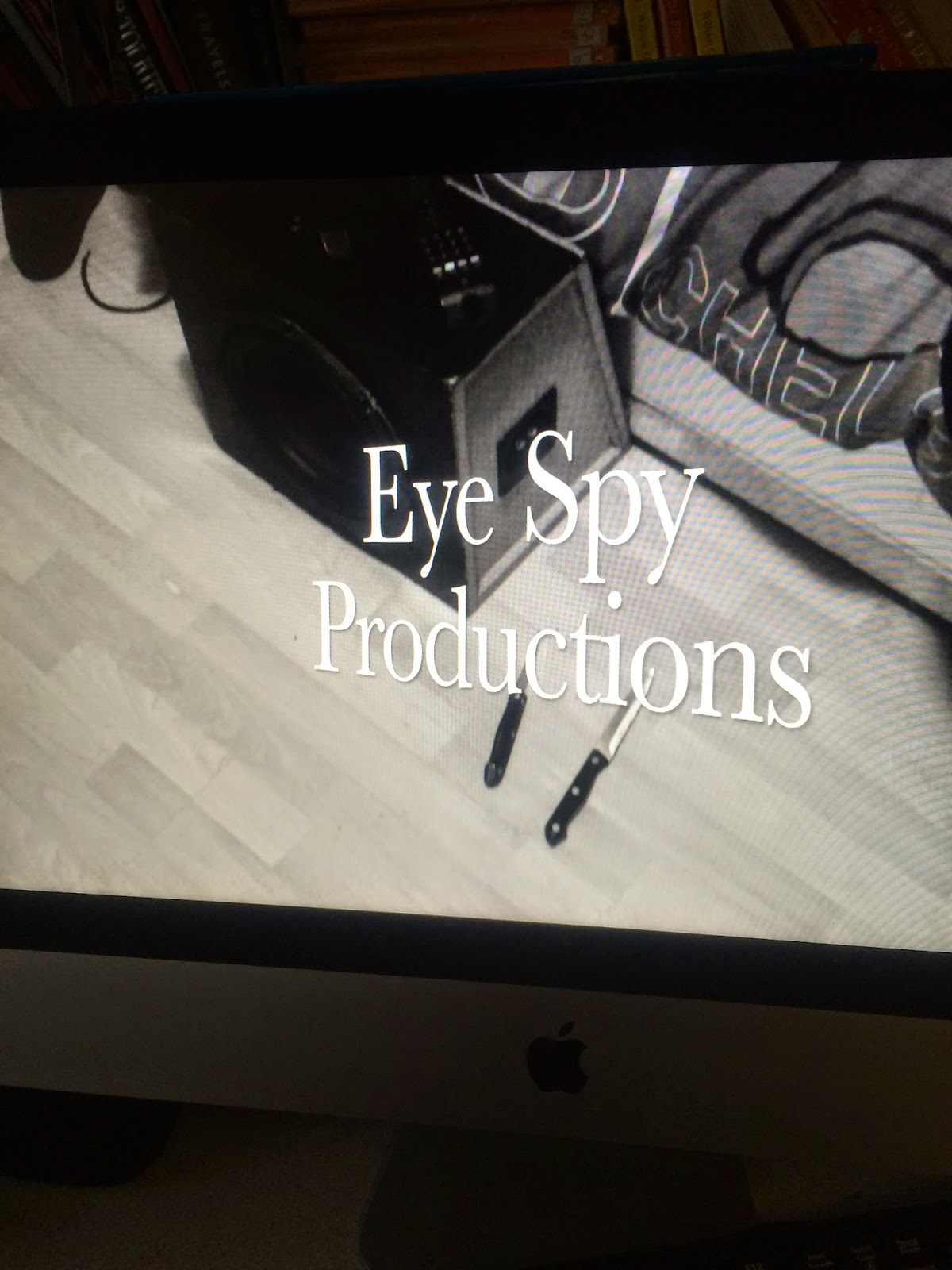
I didn't want the font or the size of the font to overpower the scene which it was placed in with the shot being knifes and the main character on the bed sleeping, the chose of text I used was simple and easy to read as I wanted the audience to be completely clear of the production logo and the production name, even the size of the text couldn't be too big. The colour of the font was white as our piece is in black and white but we didn't want it to clash with the scene behind it hence why we chose white not black.

The second choice of font was different to the first as it was the centre of attention and was the last image seen in the short opening sequence, we used black as the colour for the second font as it stood out with the light background and allowed it to be the main focus of that scene. I wanted it to be big so it was eye catching and it was very important it was seen as it is the name of the film.